UC Mobile
Student mobile design system
Overview
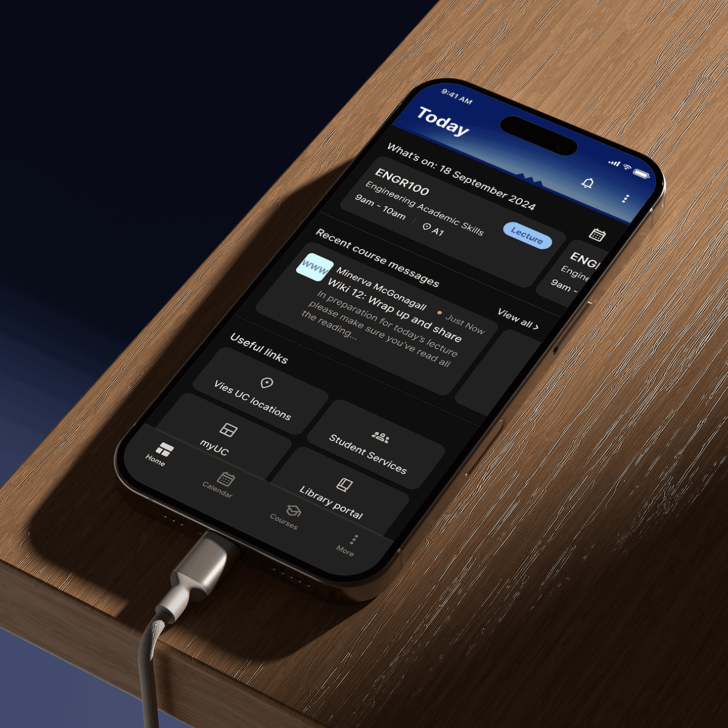
The University of Canterbury's app was designed to give students a central place to access campus information and resources throughout their time at university.
Over several years of design and development, an accumulation of design files and ad hoc developer updates had led to inconsistencies across the app, with no documentation to guide ongoing development.
As Senior UX Designer, I led the continued design of the app, working closely with developers, business analysts and product managers. The focus of this project was to establish a design system with clear documentation, reusable components and foundations that reduced inconsistencies between design and development.
Deliverables
Atomic design system
01
Design token architecture
02
WCAG accessibility testing
03
Storybook Integration
04

01
Problem
After several years of design and development, the app had accumulated inconsistent components, fragmented files and limited documentation. Teams struggled to identify the latest approved designs and understand how existing components should be used.
The app also supported dynamic light and dark modes, automatically switching throughout the day. The existing colour setup required manual conversion between themes for each new design, making updates time-consuming and developer handover less clear.
The goal was to establish a shared design system across design and development, using global styles, reusable components and Storybook integration to create a single reference point and make future updates easier to manage.
02
Design decisions
Atomic design system
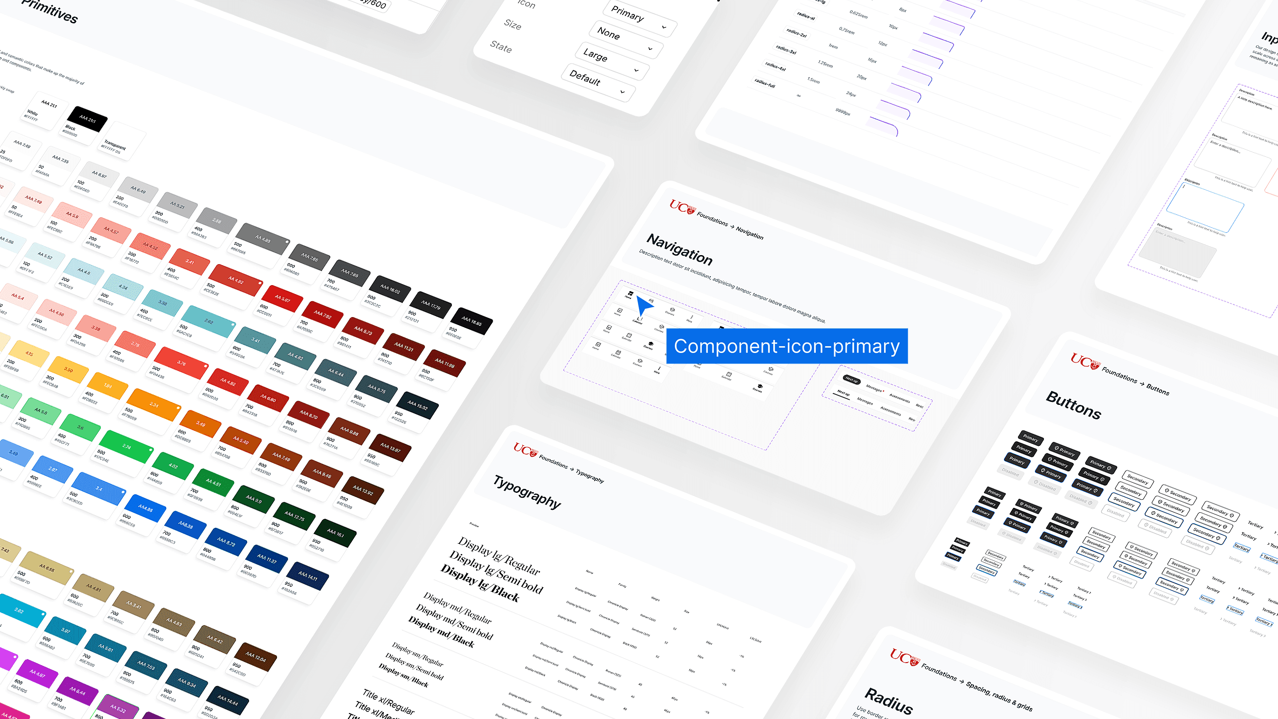
An audit of all existing design and development work was completed to identify inconsistencies and specific gaps that needed alignment. A component library was created in Figma, organised using atomic design principles. Components were built with linked typography, colour and spacing tokens and variants to define different states. Published as a shared Figma library, this gave the team a centralised set of designs to work from, removing the guesswork and reducing the time needed to design new features.
Design token architecture
A new design token architecture was developed, defining colour, typography and spacing values, replacing the previous primative setup with a more structured. This was particulary important as it supported dynamic light and dark modes within Figma, being a key feature of the app.
WCAG accessibility testing
Accessibility was built into the process, with WCAG AAA testing across colours, typography and interactive states to ensure the experience supported the University's diverse range of users.
Storybook Integration
To close the gap between design and development, I worked with the product team to plan a proposed workflow connecting Figma and Storybook. Although this wasn't implemented during my time there, we established a clear foundation for future integration to automate a lot of the manual workload.
03
Outcome
A complete design system was delivered, with organised design files and documentation making it easier for future teams to pick up and use. While wider adoption and workflow integration couldn't be completed during my time there, the foundations were in place to support this in the future.

